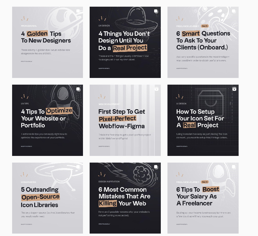
The first thing you need to be clear about (and you probably know this), is that this takes time. It takes a lot of time and work. That’s the reality, the more you work and practice the sooner you will discover new styles, new compositions, new colors, new typefaces and the sooner you will find those combinations that you like the most.
Designing something that represents you, that represents our way of working and thinking is quite complicated to summarize in a single piece, I personally do not like to talk about brand, I like to talk about ecosystems.
Talk about ecosystems instead of brand.
In other words, our website breathes the same as our Instagram. Have you heard about Apple's ecosystem? Well, it's the same theory. The key is to design a whole ecosystem that breathes what you do, your identity and there you will reflect your way of working and doing things.
Breath is the key word.
There are many things to keep in mind that you will discover along the way, but if I were to redevelop my brand from scratch, or if I were to ever consider a renewal, these would be the main pillars I would try to keep in mind the 3 most important forces:
✱ · 01: A color that represents me. If we focus on the psychology of color, you would be surprised many times why those colors we choose are the ones that represent us the most, according to the psychology they give off. It's a bit like the horoscope.
I have chosen beige. It's a very neutral color, it's not an attention-grabbing color, but it's a color that gives that accentuated touch to something flat, like the dot on the i. It's a color that gives a sense of calm and nature, bonsai. Breathe tranquility and nature, bonsai. It breathes tranquility and nature, bonsai, trees, warm lights, that's what I imagine and what I try to surround myself with.

My favorite color is black, it's a color that looks good with everything, it's elegant, serious, and professional. But obviously, I couldn't do it all black, I needed a touch of color. And that's when I incorporated beige.
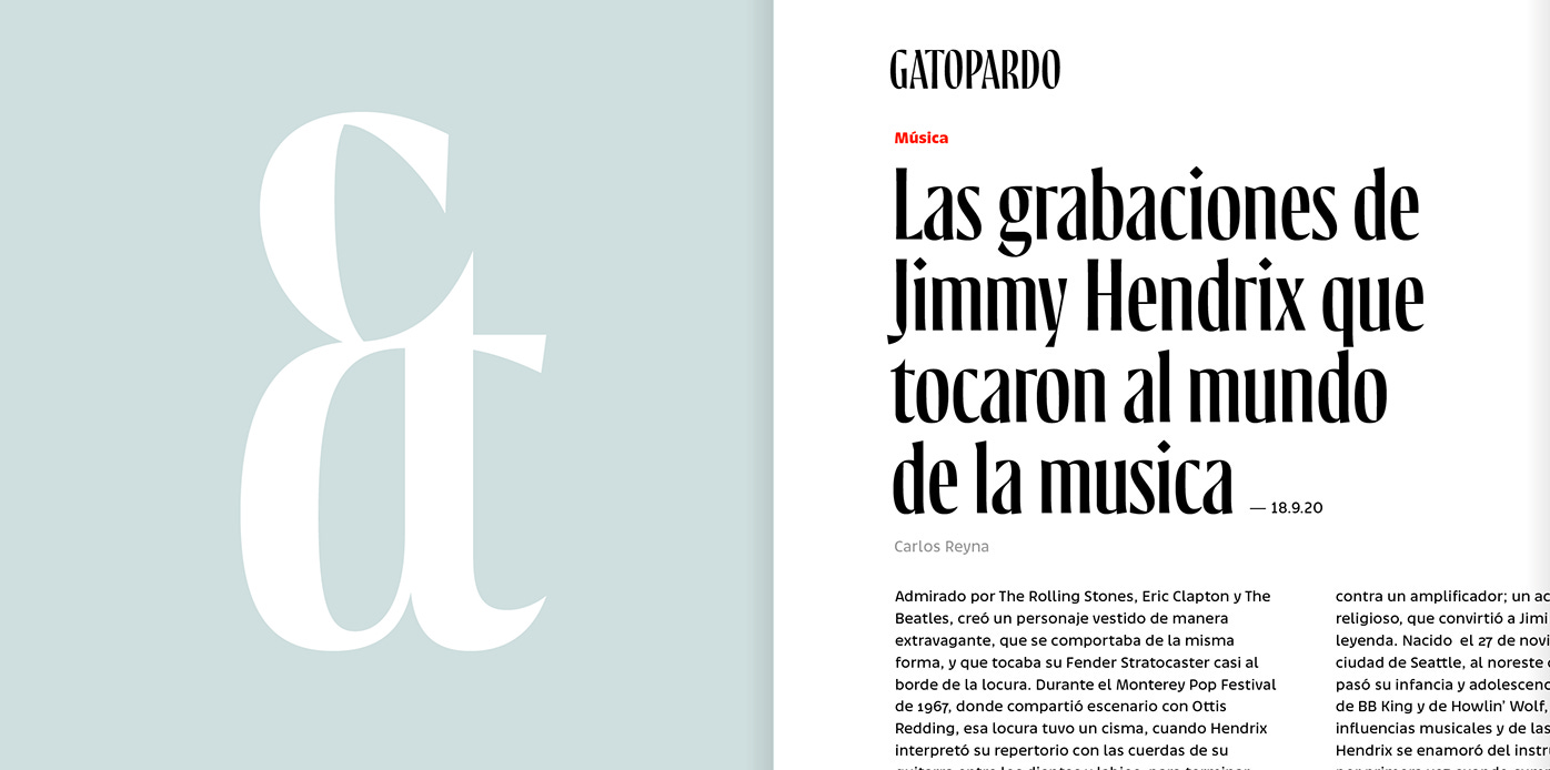
✱ · 02: One typeface. It's all about choosing a typeface that is able to reflect a little bit your identity. I have written a specific guide on how to find the best typeface for each moment, it will probably help you make that decision more easily.

The typographic world is another world, but then in practice you will see how relatively simple it is when you get down to work. It helps me a lot to see examples of other artists, as I mentioned in previous articles, I have a database where I store typographies, look & feel, aesthetics, etc.. On Behance for example I have a moodboard called "typography", and there I store everything I find. This helps me a lot to find what I'm looking for.

✱ · 03: A composition. Once you have chosen your color and typography, you will have to find a way to combine everything. This will determine the way you communicate and your tone of voice.
These were the 3 fundamental pillars, the ABC to extract your own identity. Then you can consider making a symbol that identifies your personal brand with a specific shape, or not. That's up to you. Surely branding designers hate me right now, but for me this is more than enough. With a color, a typography and a communicative composition/shape, you have enough to start with.
And finally, there are the two most important aspects that I have the hardest time applying honestly. And they are constancy, repetition and continuous work or research.
✱ · 01: Stay consistent. In the end, the most important thing is that you decide 1 colour, 1 structure, 1 typeface, etc. That you make all the decisions to create the brand, and you keep consistent with it. That you are consistent and committed to the decisions you have made.
✱ · 02: Visual repetition, creates patterns. Human beings are able to easily remember things that are presented repeatedly. Create patterns, always use the same colour, the same structure and the same typography every time you communicate.
Keep working, keep researching. Your personal brand will not be determined in 1 year, nor in 2 years, nor in 1 week. In fact, it is very normal to see how many designers change their portfolio every year, every year they have a new one. How is this possible? Because there is no formula that represents you, your identity and way of being is subject to constant change.
Thoughts originally came from my IG post. See original source.
It's impossible to determine a visual identity for someone who is constantly changing. But you can create a first iteration and then evolve it over time. Maybe after 5 years it will have nothing to do with what you did in the beginning, but the process will make all the sense in the world.
On the other hand, keep researching. The more information you store, the more resources you will have and the better you will know how to combine them. The more you research, the more resources you will discover and new styles you will experiment with.
A phrase I like a lot is:
Traveling is realizing you were wrong. How much you can extrapolate from there?
Cheers, Jordi Espinosa.


%201.svg)
%201.svg)
%201.svg)


